When it comes to your logo, we all want it to look…good. Right?
Here’s the thing, though–a company’s logo is far more than just words or pictures.
It’s a glimpse into your company’s personality….how you stand out from the crowd. It’s the most important visual representation of your brand.
A good logo can create a positive brand experience with the potential to spark feelings of trust and value for your company.
It takes a person about 9 seconds to make a decision about your brand and about three measly seconds to decide whether they’re even interested. That’s why you need to make your logo count.
But what exactly makes a good logo?
Minimal and Memorable
Branding and design firm, Siegel+Gale conducted a study to determine which company logos were the most memorable. The results?
Nike, Apple, Coca- Cola and McDonald’s.
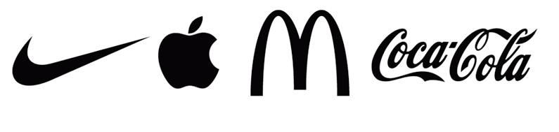 What do these brands have in common? They showcase minimal designs making them more memorable to the general public.
To come up with a good logo design, first, start with the basics. Decide on a symbol before the typography. Try to think in terms of a circle or square format when it comes to the symbol or graphic portion of the logo. This will help keep your logo more versatile moving forward (we will talk more to versatility later in the post).
Many businesses use existing fonts like Helvetica. There’s nothing innately wrong with this. Helvetica has some great things going for it. The downside? You begin to blend in with a lot of other company logos.
Blending in and logo design shouldn’t be in the same sentence. To enhance the memorability of your logo, try to use a bit of a more stylized font. Font Squirrel and DaFont and great places to start.
A custom font can be a fresh and creative option, too. Sean McCabe is one of the best when it comes to hand lettering. His site has endless resources on everything you need to know when it comes to hand lettering and logos.
Whatever route you end up taking, you want your customers focusing on your brand…not the font they recognize from another company.
Timeless
A good logo doesn’t follow trendy fads–the kind of fads that are here today and gone tomorrow. In the same breath, we have to be relevant to the day and age we live in right now.
Stay in tune with trends, but don’t be trendy.
Check out this 2016 Logo Design Trend Report by Jacob Cass over at Just Creative.
![]()
Jacob’s insights are extremely insightful. He raises some excellent points on the shifts in design and how to stay on trend.
You can create a timeless logo that will last by sticking to the 6 basic principles of design: Balance, proximity, alignment, repetition, contrast and space.
Iconic
An iconic logo clearly represents a business in its most effective, paired-down form. Your logo doesn’t need to (or should) tell an entire story. It’s meant to insinuate a distinctive brand who owns what they represent–and has a logo who clearly represents this distinction.
Take the iconic/symbol Nike Swoosh, Volkswagen’s VW and MSN’s butterfly, they are still compelling and distinctive. They know exactly who they are and have iconic logos which align nicely.
Scalability will be mentioned later, but to achieve a truly iconic design—think small. Don’t lose out on your chance at an iconic logo by muddling it up with an over-detailed, busy layout.
Keep a distinctive mindset and your logo will fall in line as an iconic representation of your brand.
Relevant
Is your logo relevant to the brand?
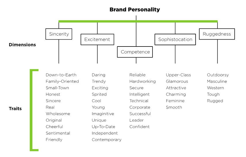
Psychologist and Stanford professor, Jennifer Aakar found five prominent dimensions that make a brand’s personality: sincerity, excitement, competence, sophistication and ruggedness—a logo should be designed with these elements mind.
Your logo must be relevant to the business and industry represented. This means research. Researching the competitive landscape will only help your business stand out from the rest. Differentiation is key here. As mentioned before, there’s no room to blend in.
Find your singularity–that is, your own voice. Own the fact that you are the only company who can offer your product or service the way you do, and translate this directly to your logo. It’s an empowering and inspiring idea…and 100% true if you focus on relevance and standing out from the crowd.
Recognizable
It’s frustrating when you’re looking for a specific cereal in the aisle and realize after several minutes of hunting, they changed the logo? This is why you should change your logo gradually, if you’re looking to make a good logo design revamp.
Take Starbucks for example. They have made several tweaks to their logos over the years. In 2011, they changed from amore detailed version of the siren, to a simplistic, paired-down solution. The design stayed recognizable while staying in step with modern design trends.
Here is a funny illustration by Felipe Torres of the past present and possible future of the Starbucks logo. Will we pair down so far until there’s nothing left but a green dot?! (Apparently Starbucks will own the rights to said dot in 2041)
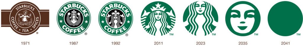
Rewinding to 2011…despite the symbol change, Starbucks kept the same font, color scheme and overall layout. They knew that reinventing the wheel would actually be detrimental. Recognizability was maintained and the response was favorable.
Here’s the thing: The same goes for you and your brand (even though the ole marketing dollars may be more limited than this coffee giant).
Our brains are hardwired to prefer recognizable brands. Respect your customer’s familiarity with your brand.
Scalable
Sometimes we can forget about this one.
Sure, the logo looks great on a big computer screen, but what if it’s scaled down to 1 inch on a business card?
Your logo should make just as much impact on a business card as it does on the side of a truck.
A busy, overly detailed logo tends to muddle together on a small-scale applications. This can distract and even add distrust with your potential customers. You want them clearly see the logo on any scale or piece of collateral.
This is why a minimal logo is vital. A good logo design with a minimal feel will look great on several mediums, and stay recognizable.
Scalable design 101: To create an effective scalable logo, make sure to use vector software like Adobe Illustrator. Vector graphics are scalable to any size–whether billboard or business card–and still maintain their high-quality, sharp nature.
Creative
While it’s important to be simple, don’t sacrifice creativity. No one likes a cliché logo with a lack of innovation.
Besides, if your logo is cliché, what are potential customers going to think about the company behind the logo?
An innovative, creative logo will always stand the test of time. The trick is finding that perfect coupling of creativity and minimalism.
Remember, your logo doesn’t need to have a 1:1 relationship to your service or product. Let me explain…
A fast food restaurant doesn’t need a logo with French fries…a gym doesn’t need a picture of a dumbbell. Be creative, while representing your business.
To use Starbucks as an example again, their logo doesn’t include a cup of coffee, but it still fits the company’s culture while being creative.
![]()
A good logo can show creativity when there’s meaning behind it, too. Apple’s logo has a bite out of the side of the apple, representing a computer “byte.”
Overall, stray from the cliché and add that creative touch to your logo. Give your customers a reason to do a double-take. Don’t use your first, second or third “good” idea. Conceptualize, hone, tweak, revise, tweak some more.
For the most part, creativity is a process. Embrace the process and your logo will thank you.
Versatile
There are countless ways your logo could be presented: websites, social media, t-shirts, flyers, brochures, signs, letterheads and coffee mugs to name a few.
Overall, there are two main elements to a common logo design:
- The Symbol (Graphic or icon portion of the logo)
- The Logotype (The company name and/or tagline portion of logo)
Creating both your symbol and logotype to be able to stand alone can give your logo some serious versatility.
Being able to use the symbol on circle/square applications like social media profile pictures, web directories, favicons, polos (to name a few), is a nice option to have. Sometimes your full logo just doesn’t work on certain mediums.
We’ve already explained the importance of scalability in a good logo design. Now, check to see if your logo can be reversed onto a dark background and still look good.
![]()
Sometimes a logo can look perfect on either a light or dark background, but the inverse just doesn’t have the same effect. Make sure you keep your logo versatile by checking how it looks on both light and dark–you’ll be glad you did in the end.
In conclusion, keep your logo minimal, memorable and recognizable. Make your logo relevant to your business type and if you must update your logo, try to keep it gradual to maintain recognizably.
Never overlook your logo’s scalability. Be creative and innovative. Stray from the cliché and consider adding some meaning behind your logo.
Last but not least, picture your logo on several types of marketing collateral and media. It needs to work on both light and dark applications in order to increase versatility.
In the end, you can read all the tips on what makes a good logo design, and while it may be helpful—ultimately it’s up to you to pave new paths and conceptualize a logo that truly differentiates.
If you’re looking for targeted inspiration for your logo project, take a look at the Logo Inspiration Generator Tool. It’s a one-of-a-kind tool meant for entrepreneurs and designers alike.
What are some of your favorite company logos? What makes them so good?
[ois skin=”1″]
Thanks for the mentions Kyle. Great write up here. I think a few more visual samples would really help solidify this article 🙂
Sure thing Jacob! I’m glad you enjoyed the post. And yes! I have it planned to add more imagery–this is one of those cases where you just need to get something out there first, then add the embellishments later 🙂
This is a great post Kyle, and so necessary. I plan to share it with some of our clients.
Thanks so much, Glenn!